How to design Fujifilm Recipes

I often get asked to create a recipe mimicking the style of specific films or photographers. Instead of doing that, let me instead show you how I go about doing it in a few simple steps.
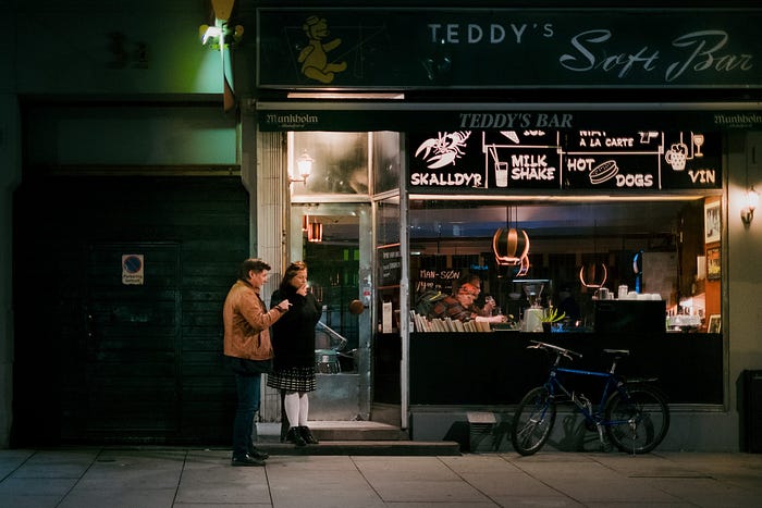
“Nighthawks” Øyvind Nordhagen, using OWH Darkness recipe

Get your references straight

Download Fujifilm X-RAW Studio

Contrast first

Dynamic range, Highlight and Shadow

  • 100: Off (might as well have been labelled that)
  • 200: One stop of highlight recovery. Requires ISO one stop above minimum (ISO 320 for X-T4)
  • 400: Two stops of highlight recovery. Requires ISO two stops above minimum (ISO 640 for X-T4)
“Trashcans and Legs” Øyvind Nordhagen using OWH Chrome recipe

Achieving film-like contrast

  • Dynamic Range 400
  • Auto-ISO minimum 640
  • Shadow +1 or higher depending on film simulation
  • Exposure compensation +0.7 or higher

Grain/Noise reduction

Sharpness

Clarity

Colors

White balance shift

Color Chrome Effect/Color Chrome FX Blue

Film simulations

  • Provia: Good starting point. Fairly neutral and works well if you are not trying to emulate film.
  • Astia: My favorite for the slightly harder contrast while still retaining beautiful color graduations of skin tones and warm greens and yellows. It also allows some “accidental” color shifts in shadows sometimes, which I find to be a nice little serendipitous nature to my recipes.
  • Classic Chrome: People buy Fujifilm cameras for this film simulation and it’s probably the most common base for Fujifilm recipes. Its trademarks are medium-low saturation, hard contrast, bright reds and a strong cyan shift in the blues. I use it occasionally, but I often find it overpowering. It has one important redeeming feature for street photographers: It lowers the saturation of dark reds and yellows, which makes things like brick, concrete and asphalt appear more neutral, allowing other colors in street scenes to stand out more.
  • Pro Neg Hi: This one is under-used in my opinion. It is very similar to Classic Chrome, but less extreme, making it more versatile.
  • Pro Neg Std: Pro Neg Hi with flat contrast. I can imagine some uses for this, but I haven’t personally used it yet.
  • Classic Neg: If you want your images to look like they were shot on a disposable film camera, I guess Classic Neg is an appropriate base. Personally I find it to be too much of an Instagram filter.
  • Eterna: Excellent for video work, but as with Pro Neg Std I always find myself compensating for its features by adding back contrast and saturation for photography. For that reason I haven’t used it in my recipes.
  • Velvia: Too harsh and green to be of any use to me.
  • Acros/Monochrome: These are good, but I’ll save them for another article.
  • Sepia: Seriously?

My wish list

“Flamingo” Øyvind Nordhagen using OWH Street recipe

That’s it!

--

--

Photographer based in Oslo. I write about photographic technique and editing.

Get the Medium app

A button that says 'Download on the App Store', and if clicked it will lead you to the iOS App store
A button that says 'Get it on, Google Play', and if clicked it will lead you to the Google Play store
Øyvind Nordhagen

Photographer based in Oslo. I write about photographic technique and editing.